Choosing Between CSS Grids or Flexbox
When designing a page in CSS you will have to decide on what type of layout system that you are going to use. There are multiple ways that you can conquer this. We used to use Tables and Floats back then, then the more preferred way to laying out a page with CSS was with Flexbox in 2009, and now ever since the CSS Grid system was released it is the more favoured approach among-st the community.
What is Flexbox?
A few years after Flexbox was published it was the recommended layout system to use. It was aimed to provide a more skillful way to layout, align and assign spacing on a web page with CSS.
The idea of Flexbox to give the container/wrapper the capability to change it’s items to fill space that is free. Flexbox is only a 1-dimensional system so it can be hard to work with, with large applications.
Here is a quick crash course on how you can get started with Flexbox today!
What is CSS Grids?
CSS Grids is the most robust layout system in CSS as of now. It has a 2-dimensional system, this means that it can target columns and also rows while Flexbox is only a 1-dimensional system. This has been created to completely change the way we design grid-based UI. It has helped a lot of us to solve the layout problems we have had when using other systems.

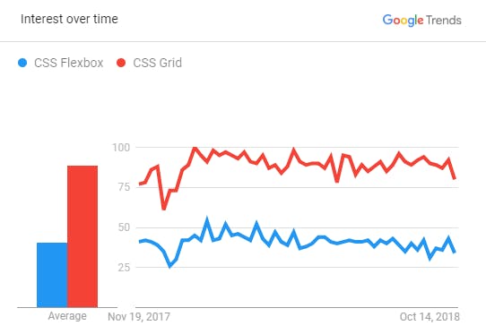
As you can see above this is a worldwide search result graph comparing how much people are interested in using a certain layout system in the last year. As you can see people are interested in CSS Grids a lot more than Flexbox as it's the new and preferred way of designing a website.
So which layout system should you use to design a web page?
Well, Flexbox is more appropriate for small-scale layouts while CSS Grids is usually used for larger-scale layouts.
Here is a quick crash course on how you can get started with CSS Grids today!
Thanks for reading!
Have a question? Connect with me via Twitter or send me a message at hello@dylansleith.com


